


Employees
OVerview
Create a landing page that provides highly relevant and actionable content for users looking for a job at Bank of America.
My role
As Senior UI/UX Designer, I led the experience from content structure through responsive design. I translated candidate and business needs into wireframes, defined scalable patterns using the existing design system, directed image selection, and aligned partners across content, design, and development.
Role
Senior UI/UX Designer
Timeframe
12 weeks
Team
2 Account Managers
2 Project Managers
4 Designers
One copywriter
2 developers
Toolkit
Figma, Photoshop

Background, Problem and Goals
01 / Background
The Bank of America About site refresh modernized the experience to better showcase the company's mission, values, impact, and employer brand. Complementing this, the Careers site provides prospective candidates with a deeper look into employee stories, career opportunities, benefits, and what makes Bank of America a great place to work.
02 / Problem
The existing employee pages featured an outdated design, an overly fragmented information architecture, and no longer aligned with the goals of the refreshed About experience. Our objective was to create a more streamlined journey that introduced the employee experience while encouraging users to continue exploring the richer content available on the Careers site.
03 / THe goal
Design a landing page that seamlessly bridges Bank of America's About and Careers sites. The experience will clearly communicate the company's commitment to its employees while introducing a streamlined, scalable design that consolidates content into richer, branded experiences and makes key actions intuitive and easy to complete.
Our plan
We decided to take a 4 step approach towards tackling the design of this page, and how it would fit into the Bank of America site ecosystem.
01
Re-envision
Clarify the brand story around what we inform, solve, and inspire.
Outcome
Build trust through a compelling narrative.
02
Define
Clarify the brand story around what we inform, solve, and inspire.
Outcome
Guide purposeful action and engagement.
03
Build
Establish a flexible content foundation, starting with an MVP.
Outcome
Prepare the site to scale and adapt.
04
Deliver
Create a polished, high-impact landing-page experience.
Outcome
Improve experience while reducing maintenance.
Content Strategy
Our first approach to this project was making sure we first nailed down the proper content strategy for this page. We thought about:
our audience
the sitemap and zone diagram of the page
what content we need to keep, modify, remove, or move from the old site
Zone diagram and Information Architecture
We first had to take a look at the old employees framework and ask ourselves: "what content do we need to keep, modify, and remove?" In the end, the team decided to influence a total of 11 pages. We also thought about what our audience would look like, and what content we might need on our new page to serve these users.


Our Audience
We thought about what our audience would look like, and what content we might need on our new page to serve these users.
Clients & prospects
Current clients and priority retail prospects.
What parts of the zone diagram solve for this audience?
Our values
Awards and recognition
Community leaders
People & nonprofits working to create impact
What parts of the zone diagram solve for this audience?
Awards and recognition
Stories from the team
Showing up in times of need
Media Professionals
Journalist and bloggers
What parts of the zone diagram solve for this audience?
Annual report
Awards and recognition
By the numbers
Iterations and Wireframes
Based off all of our previous analysis of the content strategy and zone diagram along with client needs we began creating a few wireframes using components from our design library.

What the original page design looked like

V1 Wireframe

V2 Wireframe
Challenges
Late in the design process, stakeholders requested support for 16 employee stories, with the ability to support up to 97 stories. Displaying every story on the primary Employees page would have increased cognitive load and diluted its core message. We proposed a hub-and-spoke model: a curated selection of stories on the main page thats supported by a dedicated Employee Voices destination. This preserved a focused primary journey while creating a scalable framework for future stories.
Employee Voices Page

Notes board keeping track of all the employee stories
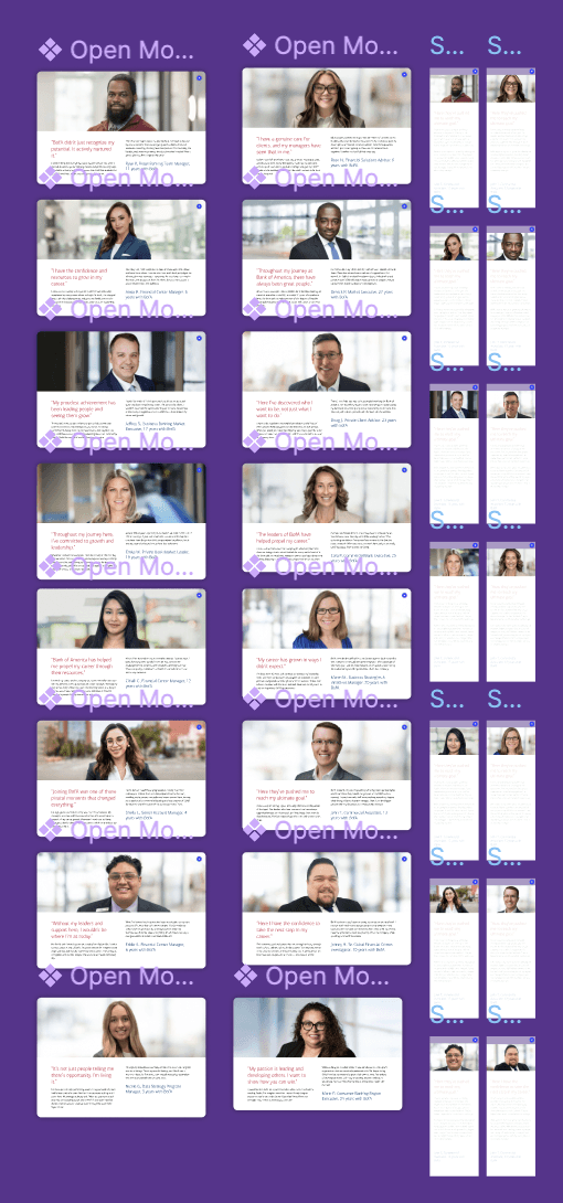
all of the employee story modals

Added section into the main Employees landing page
Final Product
As we were working on this page, clients informed us that there would be an additional landing page that needed to be created in conjunction with the employees page. As you can see, we added a section for employee voices on the main employees page, with a seperate employee voices page that users can navigate to should they decide they want to dive deeper into all of their stories.
Final Employees Landing Page
Final Version
Takeaways
This project reinforced the importance of establishing a clear content strategy before moving into visual design. By prioritizing employee needs, simplifying the information hierarchy, and reusing patterns from the broader About Us experience, We created a page that feels approachable and consistent with the Bank of America brand.
As the client’s priorities and initial proposals evolved, the project kept us on our toes. Our team stayed flexible by using adaptable layouts, reusable components, and open communication to respond to new requirements without losing sight of the page’s core purpose. Exploring multiple directions allowed us to welcome change while maintaining a clear and cohesive user experience.
If I continued this work, I would validate the final experience with employees and prospective candidates, then use their feedback and engagement data to further refine the content and navigation.