LIFELOG
Introduction
Completely redesigning LIFELOG, an online web-service that provides users with the ability to merge daily journaling and money tracking.
Lifelog was originally designed by Bryan to be his personal journaling and financial tracking app. He created it because he wanted a way to merge his personal journal with his financial tracker and have it be accessible to him from anywhere. He wanted to bring his personal project to the public, but a redesign was needed as he felt that it was not sufficient enough to bring it to the public.
Role
Freelance UI/UX Researcher and Designer
Timeframe
January 2022- March 2022
Client
Bryan Chen, LIFELOG founder
Toolkit
Figma, Adobe Suite
DESIGN PROCESS
User Research
To understand why and how users used LIFELOG, I needed to talk to the people! However, I learned that LIFELOG currently does not keep a database of their users. So, I interviewed 5 peers with different demographics to get a feel for their journaling and financial tracking habits, as well as their motivations for doing so. From those interviews, I developed a few user personas to help me summarize their needs and frustration.
User Personas
The Problem
Users often have difficulty maintaining consistency journal, financial tracking, or both. Lifelog solves these issues by merging these two activities together. However, the current Lifelog website is underdeveloped and unintuitive to use, leading to low user engagement and satisfaction.
User Pain Points
-
There are many aspects of the website that are difficult to use. The biggest example of this is that the tag function is very confusing and unintuitive.
-
The look and feel of the website gives the users the impression that the website has not been finished yet. There is little organization to the website; for example, the subscription tracking service would logically be in the transactional tracking area, but it is instead on a completely different page.
-
Users feel as if the site is untrustworthy and illegitimate because there is no brand or design system to ensure that the product is aesthetically consistent or pleasing.
Goals
This lead me to formulate the ‘how might we question’:
How can Lifelog create a seamless experience merging journaling and financial tracking?
Lifelog’s past design
Original Financial tracking and journaling page
Original spending analysis page, with subscription tracking above it (not shown)
Redefining the brand
I created a design system and an entirely new logo to bring consistency and freshness to the brand. I started with a type system and a color system, and from that developed the other toggles and buttons. Additionally, I also designed the logo of the website, where for my final iteration I incorporated the primary color to unify the design system and logo to create a brand.
Low Fidelity Wireframes + Initial Ideas
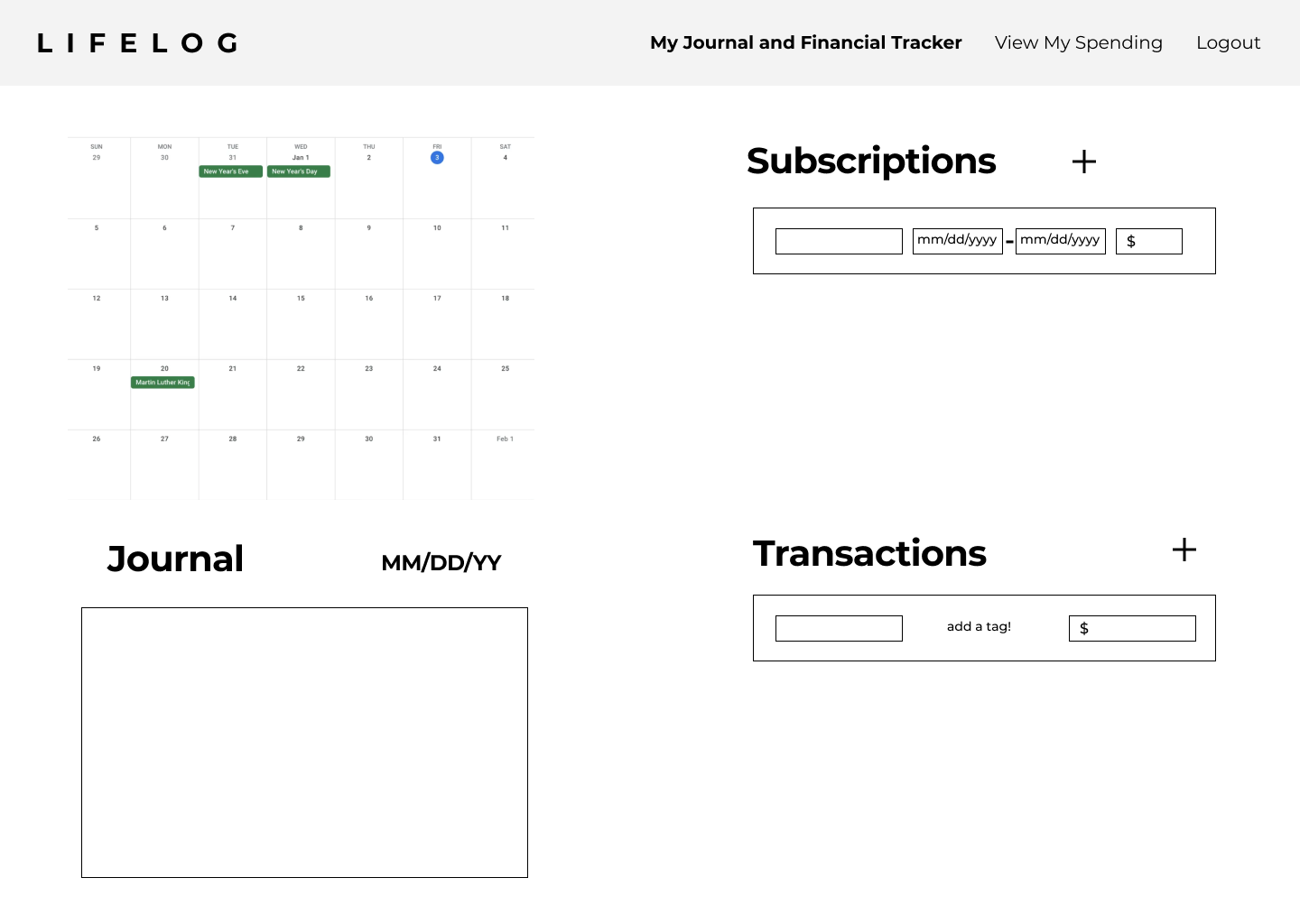
I wanted to mimic the old design as much as possible while still keeping the new design crisp, exciting, and more intuitive to ensure prior users wouldn’t feel like they are using an entirely different product.
Here users still have the basic functions of rating their days, journaling, and keeping track of their spending all in one place.
Mid fidelity + Prototype
After the design system was created, I added the primary color scheme and refined the look of the product.
Additionally, I added a prototype to allow users to test the new tag functionality.
Second Round of User Testing
I then performed user testing on 5 more individuals using my mid fidelity design and prototype, and received a lot of feedback on how to improve its usability.
Final Product Overview
Journal and Financing made easy
Rate your days from 1-10 with an intuitive and colorful scale that allows you to tell at a glance how your day or week has been. Add any transactions you made after you log your journal to accurately keep track of your finances.
Freely edit for accuracy
Easily edit any of your transactions and make sure that you are tracking your finances in the most accurate way. Go back and look at your previous days to revisit your journal and transactional history for any edits you want to make.
Combined Transactions for easy tracking
Subscriptions and transactions are now combined, allowing for users to do it all in one place. Tags have been changed to a dropdown menu for ease of use and better scalability. You can also make custom transactions that are saved for later use.
Refined visuals
View your spending in an organized and color-coded graph that allows you to easily track your money through any timeframe.
My Takeaways
Redesigning this website by myself has made me realize how important it is to be confident in your design choices. I realize one of the best ways to start designing is to start simply, and slowly build on each element until it is refined; otherwise, it is easy to get overwhelmed by the amount of design options available.
Challenges
Working without a team makes it hard to feel as if you are making the right choice; there is no second pair of eyes to help tell you if your designs are not working visually or intuitively. I had to remain positive and self assured in order to keep progressing. Additionally, creating a design system for the first time was difficult, and I had to learn how to use the resources around me to create one from scratch.
Whats Next?
If the client were to come back and hire me again to further improve his website, I would add the functionality of analyzing the daily journal rating. I would create a new graph to show trends in your ratings of days through any timeframe. Currently, the client is working on implementing these changes to his new website. Stay tuned for more updates!


